
Credits by way of James Bond opening title montage!
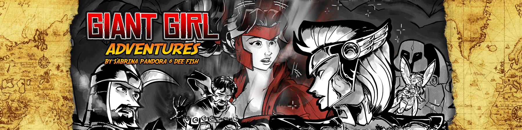
This one may appear a bit tiny, because in print it will be a 2-page spread. So click to embiggen, for sure.
We thought we’d take advantage of the revised opening to showcase a few things. Like the fact that Ronni is on the TSA’s ‘No Fly List’, which should come as no surprise to anyone. Giant Girl in a metal tube full of 200+ people flying 35,000 feet off the ground sounds like a recipe for disaster, right?
With this in mind, and the fact that her bad luck tends to keep her perpetually broke, we thought showing how she uses her shrinking powers to sneak into the airport and onto planes was something that we would show, rather than tell, how she circumvents authority and does what she pleases. And once again, we return to the dotted line for adventure, as she leaves a smoking Atlanta and heads to a not-yet-smoking Seattle.
Yet.
The fact that she doesn’t bother to change out of her costume to do all of this also says a lot about her, I think. Low profile is not her thing. But inflight entertainment courtesy of a movie saved on her phone, relatively the size of a big screen TV, and snacks she blows up for economy-sized enjoyment are definitely her thing. SMRTFÜD FTW!
Once she gets where she’s going, she gets big, yet light, to catch air currents, and creatively manipulates her mass to get from SeaTac to Seattle proper, startling pigeons and using her phone to navigate as she calls 64 Bit to coordinate their meeting in the Emerald City.
EDIT: Since it came up, the soundtrack to this sequence, which I have no rights to nor make any claim to;
https://www.youtube.com/watch?v=Zc3KXwd8ZWQ
DEE’S NOTES
This is a sequence that, in the original script, was two pages written in a more traditional grid. There was a lot of fun story being conveyed in the sequence that silently showed how, as Sabrina explained, our heroine traveled on the cheap. After some discussion and doodles, we decided to go NUTS with the composition and layout and really open up the concept.
Normally, I am a much more subdued artist where page layout is involved. I prefer clarity of storytelling over fancy design, but in this case, I think the sequence called for something special. It establishes, for new readers, SO much about Ronni, her powers AND her personality.
We both did a lot of work in the reference stage to make the backgrounds fairly accurate and I enjoyed adding gags in the background to give it some more fun.
Issue 17 – Page 004-005
Recent Comments