Don’t call it a remake!
This is the first full retread of one of the original pages. We rewrote the intro to make the beginning of the book also an introduction to the character and the world. With that accomplished, what was formerly page 2 is being re-envisioned here, Dee style.
To be honest, I’m pretty sure Koen followed exactly what I was asking for with the original layout. I’ll post the original in the comments, although I won’t be doing that throughout this process. I had an annoying tendency to just pack panels with big blocks of dialogue. Dee convinced me to start breaking statements up to make them more readable, and I can see the folly of my ways in the past as I review these old pages.
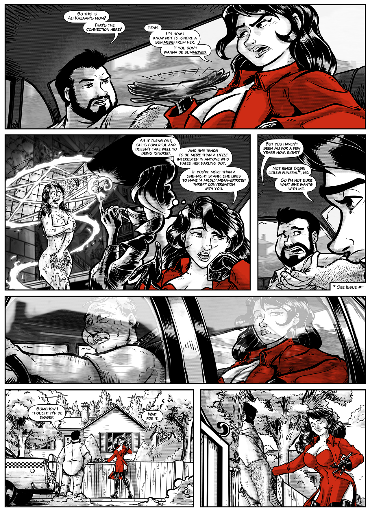
Poor nervous cabbie, worried that he’s gonna end up flattened in his own cab. The scenery sliding past in the window as he drives works SO darn well, too!
I love the little unassuming little house. You’d never look twice at it from the street.
Oh, and there’ll be a Mature version of this page on the Patreon, for folks of that tier of support who would like to see a little more of Ronni….
DEE’S NOTES
I love pages like this for a number of reasons. One, of course, is that they offer something of a breath between more dense or actiony scenes for both the readers and myself as the artist. But it’s also a great opportunity to draw what I kinda like to draw most: character conversations.
I love working out the “acting” on faces and body language, and scenes like this are wonderful opportunities to dig into the characters and play.
To achieve the reflection in the window, an effect that I think really helps sell the drama of that moment, I got an image of houses from that area from the right POV, converted the photo to line art, gave it a little motion blur and overlaid it atop the art. It really has that look of a reflection on glass, where you can still see through it, and I am happy with how it came out.
Issue 17 – Page 007

Recent Comments