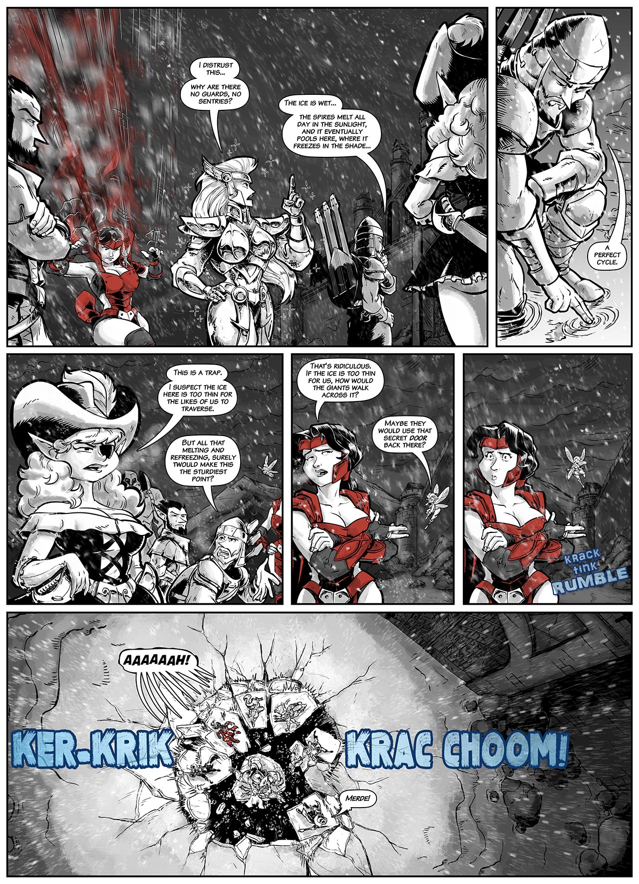
It’s A Trap!
DISQUSWe’re still wrestling with this, so bear with us. You can comment if you go check 2/3 of the way down the gold rectangle on the very bottom of the site, and look for ‘recent comments’. OR if you navigate to the previous page, you can see the comments there, and then if you navigate back to the current page the Disqus will be visible. If any of you out there have experience and a solution for this, we’re all ears.
Meanwhile, this is our workaraound. Feedback from the fans is what tells us how our work is received, and it’s an important part of the process, particularly in a longflow story like this. We look forward to hearing from you, and your perspectives, whether you think we are going great or off the mark on something, we love to hear.
In short, we’ve got a pain in the butt comments section, and we apologize. Under construction, please excuse our mess.
Also, is center aligned text irritating to read for you? Because I’m testing that with this post. Comment on this as well if you don’t mind. Again, feedback.
As for the page…
I dug the shrinking effect, as Dee explains below- it gives the impression without having to overclutter the page, yet it adds animation, motion and action to a page that is basically the same camera angle as a daily three-panel strip. I adore Britomart’s pontificating pose- as our webmaster pointed out, she’s literally doing the ‘Well, actually…’ pose here
Flynna. Cheeky!
Swann figures out the cycle while Flynna intuitively knows it’s a trap, and she’s right, as we see by the end of the page. Never argue with the expert padfoot, Ronni.
I insisted on panels 4 and 5 just being the change in Ronni’s posture and expression, because I love these comedic bits where the artwork sells the gag.
DEE’S NOTES:
While action sequences are a lot of fun to draw, I really love pages like this where I get to dig into the characters, do a little “acting” and play to the personalities and humor. I loved also, getting to play to my background in humor comic strips with Ronni’s gag where the ice cracks.
With this page, I’m also changing up how I render Ronni’s growing and shrinking. Rather than drawing the individual elements, I’ve decided to play with the software and do some selective radial blurring for growth panels where she’s not MOVING specifically in the effect.


Recent Comments